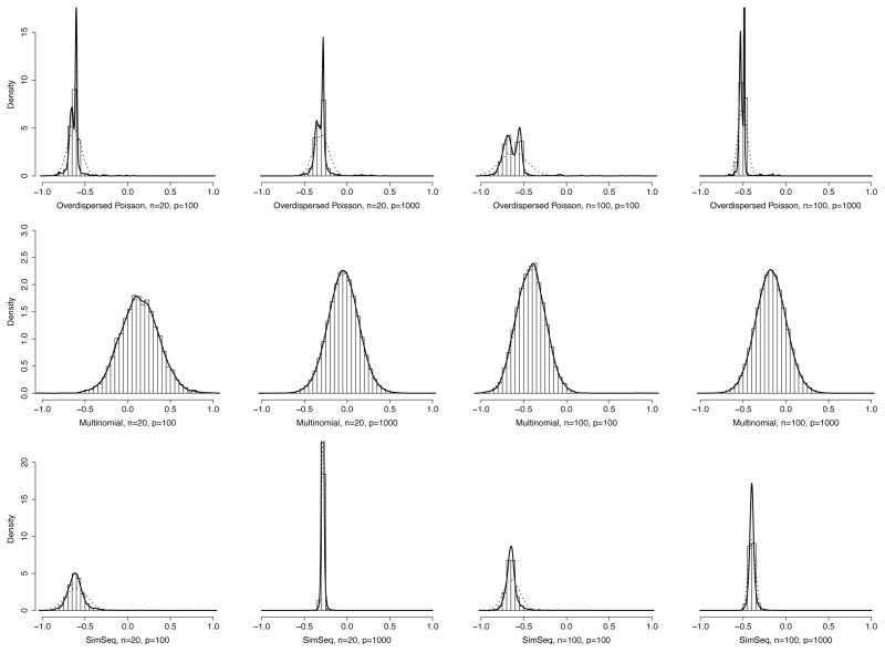
Fig. 1.
Distributions of the cPLS-association scores in all simulation settings presented in Table 1. The plots include histograms of the association scores, fitted densities (solid black line) and the respective normal distribution curves (black dotted lines). These fitted densities and normal distributions match the ones used in computing the local FDR:s.

