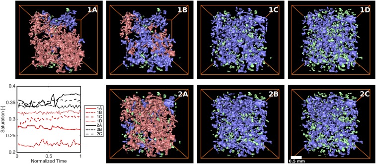
Fig. 1.
Ganglia populations contributing to average saturation. Average saturation is plotted versus time, and volume renderings of ganglia at the end of the experiment are shown, for experiments 1A to 1D and 2A to 2C. Ganglia are subdivided by size: large (pink), medium (blue), and small (green). Flow is from top to bottom. Time from the beginning of the experiment is normalized by the total experimental time (Table 1).

