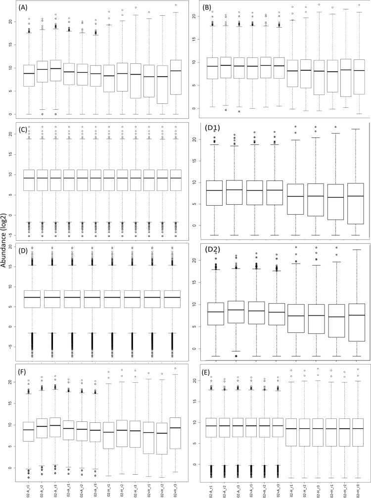
Fig 4. Comparison of expression distributions resulting from different normalization methods.
Shown are standard boxplots of normalized gene expressions. On the x-axis are the different samples (e.g. 02A-1 = 2h time point abdomen body part, no rivals, replicate 1) and the on the y-axis the log2 gene expression. Panel A shows raw expression levels, B RPM normalization to a fixed total of 50M reads, C quantile normalization, D subsampling without replacement + quantile correction, E the DESeq2 normalization and F the edgeR normalization. D1 and D2 show normalization by subsampling (to 50M reads) with and without replacement normalization, respectively.

