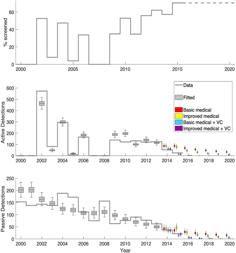
Fig 5. Model fit to data.
The top graph shows the annual level of active screening achieved in the focus. The middle and bottom graphs show the observed active and passive case detections as a solid grey line with the model fit (years 2000–2013) displayed as grey box and whisker plots. The model projections of the four strategies for 2014 onwards are shown as coloured box plots and include combinations of either basic or enhanced medical strategies and vector control. Improved medical strategies had increases to the passive detection and reporting rates from 2015, whilst vector control strategies began in 2014. Purple boxes denote the strategy that took place with both improvements to passive screening and tsetse control.

