
Figure 4.
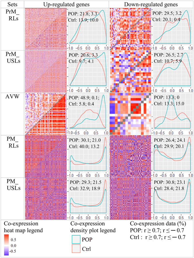
Co-expression heatmaps and density plots. Heatmaps display Pearson correlation coefficients for gene expression in controls (above the diagonal) and cases (below the diagonal). Density plots present correlation coefficients distribution for controls (blue) and cases (red) with addition of percentage of Pearson correlations (r-values) ≥ 0.7 and ≤ -0.7. Density plots x-axis: Pearson correlation coefficient (r), y-axis: density.