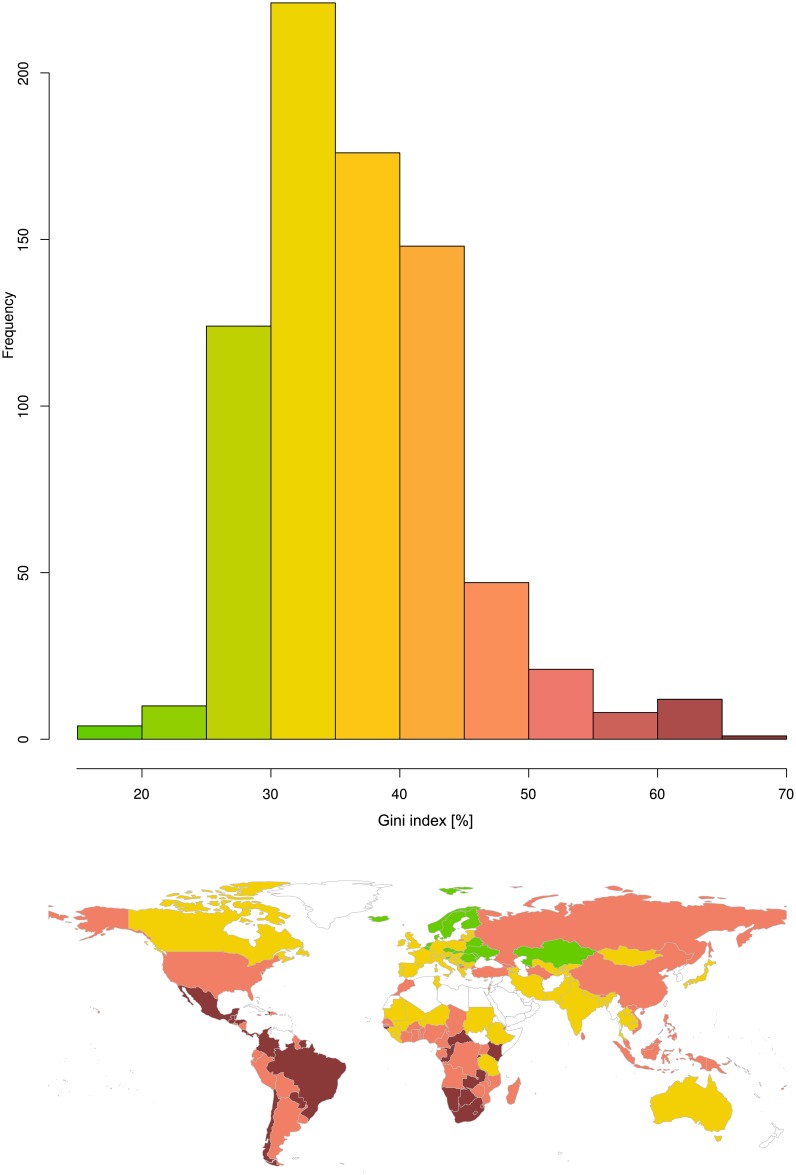
Fig 1. Raw Gini indices of the latest Gini indices for the countries as estimated by the World Bank based on income.
Top: The histogram shows the distribution of the raw Gini indices. Bottom: World map with countries colored according to the color ramp used in the histogram, i.e., low Gini index values are shown in green, high Gini index values are shown in dark red. Empty (white) regions indicate either lack of information or information judged as of poor quality by the publisher. The Fig has been created using the R software package (version 3.4.0 for Linux; http://CRAN.R-project.org/ [18]). The world map was drawn using the “mapCountryData” function of the R package “rworldmap” (South A.; https://cran.r-project.org/package=rworldmap [36]).

