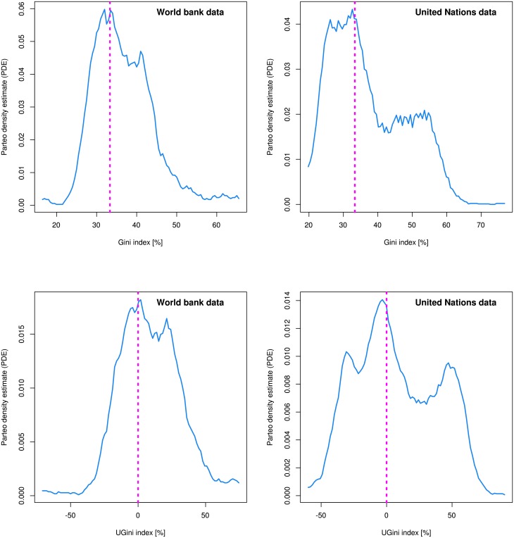
Fig 2.
Comparative display of the probability density function of the distribution of raw Gini indices (top) and the novel UGini indices (bottom). The blue lines indicate the estimate by applying the Pareto Density Estimation (PDE) [19]. The dotted perpendicular magenta lines are drawn at the Gini coefficient of the uniform distribution at Gini = 33.33%, or at the UGini coefficient of the uniform distribution at UGini = 0%, which both intersected the PDEs at their maximum or very close to it. Left: Indices of countries estimated by the World Bank based on income. Right: Indices of countries of the test data set derived from the information provided by the United Nations University World Institute for Development Economics https://www.wider.unu.edu/download/WIID3.3. The differences in the distributions may be attributed to the different origins of the data sets or result from different methods in preprocessing (cleaning) of the data before publication. The Fig has been created using the R software package (version 3.4.0 for Linux; http://CRAN.R-project.org/ [18]).

