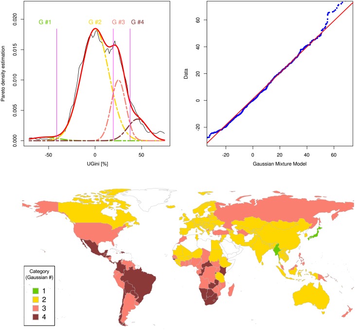
Fig 5. Distribution of the unambiguous standardized Gini indices (UGini) of countries as estimated by the World Bank based on income.
Top left: The density distribution is presented as probability density function, estimated by means of the Pareto Density Estimation (PDE [19]; black line). A Gaussian mixture model (GMM) given as , where mi, si and wi are the parameters mean, standard deviation and relative weight of each of the Gaussians, respectively, was fit (red line) to the data, with a number of mixes of M = 4 (Gaussian, G #1 .. G #4) shown as differently colored lines. The Bayesian boundaries between the Gaussians are shown as perpendicular magenta-colored lines. Top right: A quantile-quantile plot comparing the observed distribution of standardized Gini indices with the distribution expected from the GMM (abscissa). Bottom: World map showing the countries classified for Gini index categories. The four categories correspond to the four Gaussian modes identified to best describe the distribution of the standardized Gini indices. The Gini index increases with the number of the category and low Gini index values are shown in green while high Gini index values are shown in dark red. Empty (white) regions indicate either lack of information or information judged as of poor quality by the publisher. The Fig has been created using the R software package (version 3.4.0 for Linux; http://CRAN.R-project.org/ [18]); specifically, the GMM was drawn using our R package “AdaptGauss” (https://cran.r-project.org/package=AdaptGauss [25]) and the world map was drawn using the “mapCountryData” function of the R package “rworldmap” (South A.; https://cran.r-project.org/package=rworldmap [36]).

