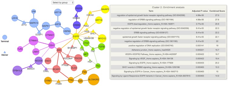
Fig 1. Functional enrichment analysis of the final subnetwork using the EnrichR API.
The node sizes and edge widths are proportional to the amount of times that node or edge appeared in the noisy runs. Nodes are colored according to cluster membership. As in the EnrichR API, the p-value is calculated using the Fisher test and adjusted for multiple hypotheses. The top 15 functional enrichment terms for each cluster are ranked according to the adjusted p-value and displayed in a tabular format when the mouse hovers over a node in that cluster. Each cluster can be visualized separately by “Select by group” icon located at the top of the figure.

