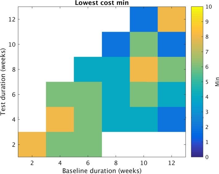
Figure 4.

Optimizing “min”. Similar to figures 1 and 2, each grid element represents a summary of numerous simulated trials. Each color element represents the lowest value for the minimum monthly seizure rate during baseline (min) selected. To be selected, all combinations of min and N were evaluated for cost (Equation (3)), requiring >=90% statistical power for a chosen combination. The value of min that optimized cost is displayed for each grid element. To identify the values displayed, N was tested for N = 100,150,200,…,900. Min was tested at 2,4,6 and 8. The x axis for all graphs represents number of baseline weeks (B). Of note, values greater than 8 were not tested, therefore white represents situations in which the lowest min value is unknown.
