
Figure 1.
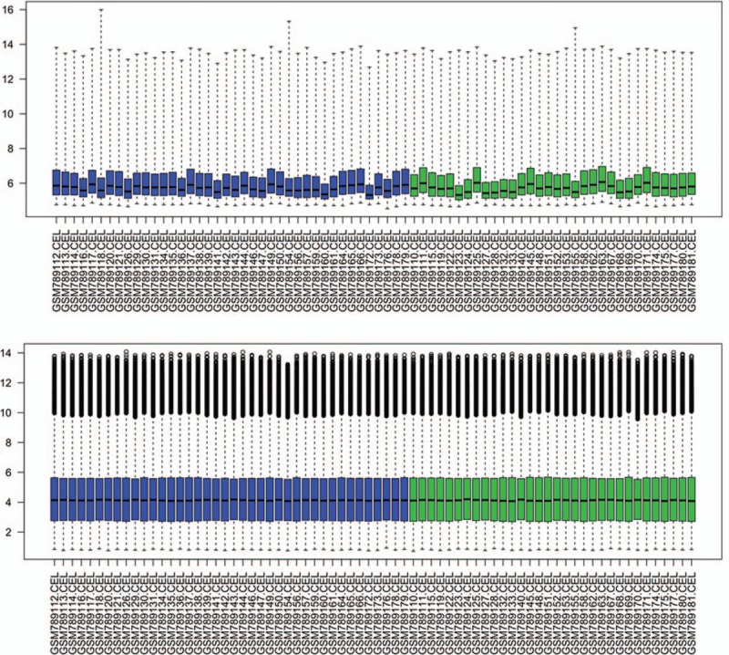
Box plot of gene expression profile data before and after normalization. The top box represents the distribution of data before normalization, and the bottom box represents the distribution of data after normalization. Horizontal axis represents 72 nonalcoholic fatty liver disease samples.