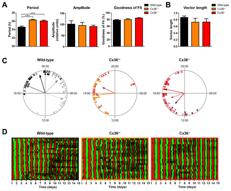
Figure 1. SCN cells show stable coupling of molecular rhythms in Cx36+/− and Cx36−/− mice.
All data presented in this figure are from the same SCN explants. (A) Mean circadian period, amplitude, and sine wave goodness-of-fit of cellular mPer2Luc rhythms of cells in SCN explants from wild-type (black), Cx36+/− (orange), and Cx36−/− (red) mice. Data are shown as mean ± SEM. Period: F2,173 = 17.71, p = <0.0001, post hoc: ***p ≤ 0.001. Amplitude: F2,173 = 0.2086, p = 0.8119, post hoc: not significant. Goodness of fit: F2,173 = 2.947; p = 0.0552, post hoc: not significant. One-way-ANOVA with Bonferroni post hoc test comparing all data sets with each other; wild-type: n = 77/4 (cells/explants); Cx36+/−: n = 40/2; Cx36−/−: n = 59/3. (B) Mean vector length of phase distribution of cellular mPer2Luc rhythms of cells in SCN explants on day 5 of in vitro culture. Data are shown as mean ± SEM. F2,6 = 1.177, p = 0.3705, post hoc: not significant. One-way-ANOVA with Bonferroni post hoc test comparing all data sets with each other; wild-type: n = 4; Cx36+/−: n = 2; Cx36−/−: n = 3. (C) Phase distribution of single cells from different SCN explants. Data are shown as Rayleigh plots with circles representing 24 h of day 5 of in vitro culture and each triangle representing the mPer2Luc peak phase (time of day) of an individual cell. Cells from different explants are shown in different colors. Each vector represents the average peak time of cells from an SCN explant, and the vector length represents the phase clustering. A longer vector means greater concentration of the data near the mean, and thus less likelihood of the data being uniformly distributed. (D) Raster plots of mPer2Luc bioluminescence intensity of individual wild-type (left, n = 25), Cx36+/− (center, n = 20), and Cx36−/− (right, n = 20) SCN cells in one slice per genotype. Each horizontal line represents a single cell, with time in days in culture plotted left to right. Values above and below the mean are shown in red and green, respectively.

