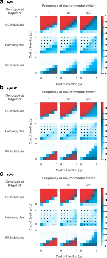
Fig. 4.

Average genotype frequencies in the model with a switching environment. The frequencies are displayed according to the frequency of environmental change expressed in host generations, the cost of bleeding (y axis) and of infection (x axis). The average genotype frequencies across 100 simulations, each with 10,000 generations, are displayed for ch = 0 (a), ch = ci/2 (b) and ch = ci (C). The frequencies are color-coded according to legend on the right. Stars indicate an excess of homozygotes
