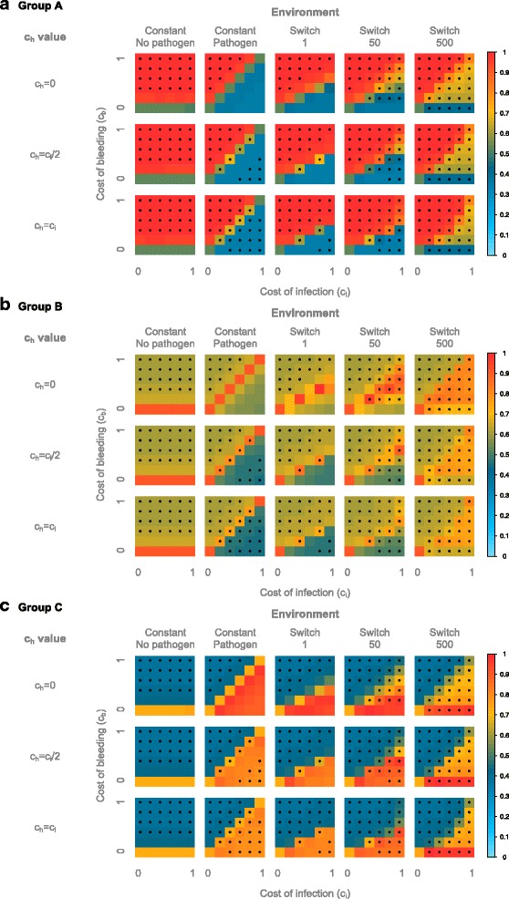
Fig. 5.

Similarity of the simulated populations to the natural populations. a) Similarity to populations from Group A, b) Similarity to populations from Group B, c) Similarity to populations from Group C. The similarity is displayed according to the value of ch, the cost of bleeding (y axis) and of infection (x axis), and the modeled environment (constant with- or without pathogen, and switching between a pathogenic- and non pathogenic environment every 1, 50 or 500 host generations). The similarity is color-coded according to the legend on the right. The similarity is calculated as one minus the average absolute difference between the simulated and natural genotype frequencies, hence a similarity of 1 is achieved when the genotype frequencies of the simulated populations are equal to that of the natural populations. Stars denote an excess of homozygotes
