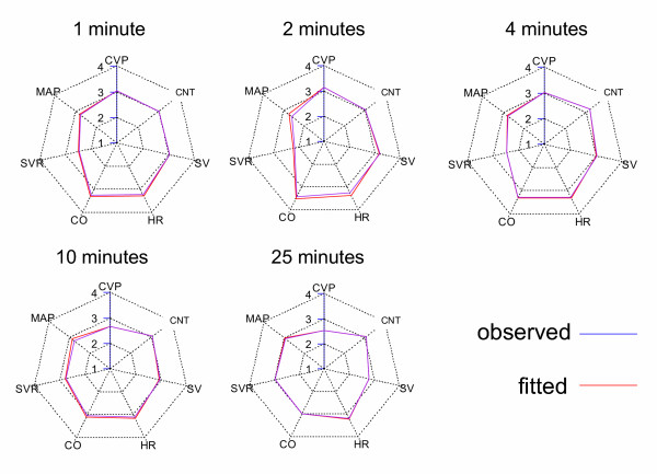
Figure 8.
Best fit cardiovascular radar plots for each key time point. Cardiovascular radar plots of the observed data (blue) and the best fit of the final cardiovascular model (red). Note that the shape of the radar plot changes with time, indicating the evolving effects of magnesium on the circulation. For each time-point, the fit was an adequate account of the data (Table 3).

