
Figure 2.
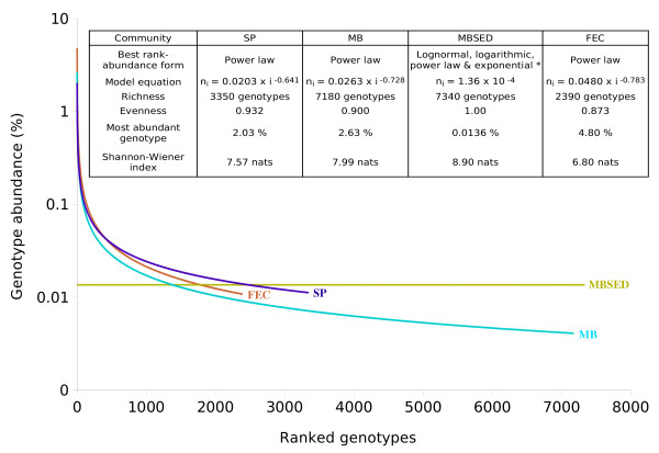
Comparison of the structure and diversity of the different viral communities using PHACCS. The graphics represent rank-abundance curves, where the abundance of each genotype is plotted versus its abundance rank, the genotype of rank one being the most abundant. The curves were obtained by plotting the PHACCS rank-abundance values of the different communities on the same axis. *The predicted community structure for MBSED was the same for the lognormal, logarithmic, power and exponential rank-abundance forms. As a consequence, the diversity predictions were also the same.