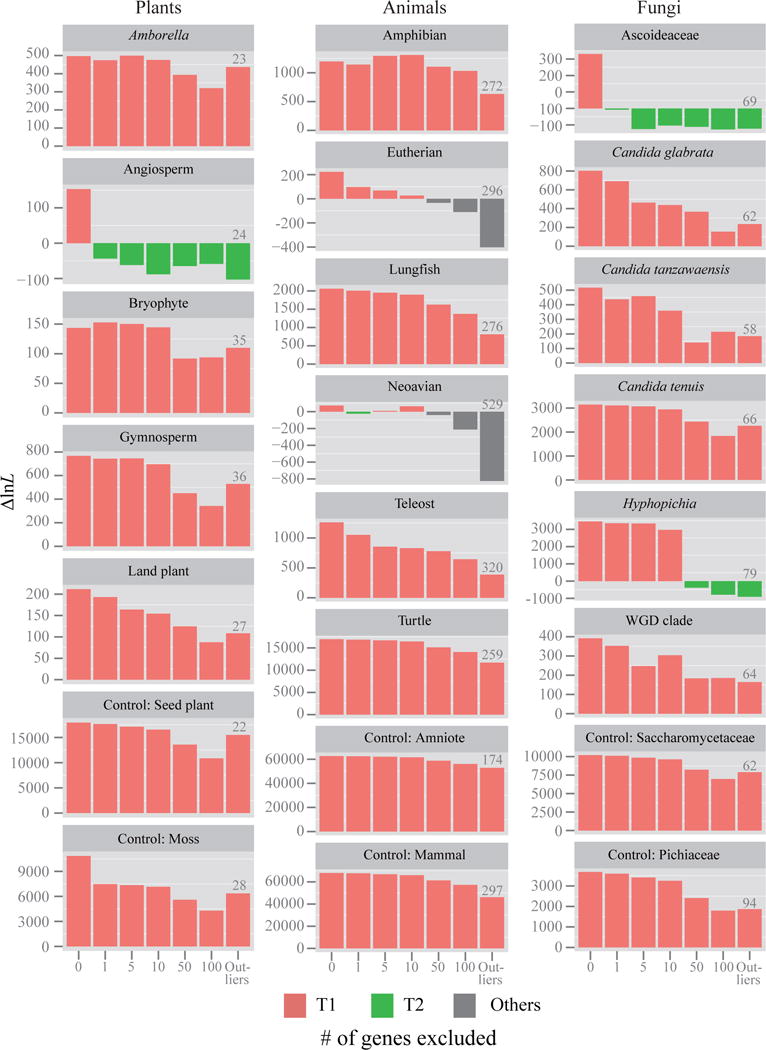
Figure 3. Quantification of the effect of the removal of tiny amounts of data on the branch’s topology for 17 contentious branches in plant, animal, and fungal phylogenomic data matrices.

For each branch, the 1, 5, 10, 50, and 100 genes with the highest absolute ΔGLS values were excluded; we also excluded the genes with outlier ΔGLS values (the number of outlier genes is given above the corresponding bar for each branch). The Y-axis shows the difference in log-likelihood scores (ΔlnL) for the favored topological hypothesis. The different hypotheses favored are indicated by different bar colors; red bars denotes that ML trees inferred from their corresponding data matrices support T1; green bars denote ML trees supporting T2; gray bars denote ML trees supporting hypotheses other than T1 and T2. The ΔlnL values displayed on the Y-axis corresponds to the difference in log-likelihood values for T1 against either T2 or “others”. If ΔlnL is > 0, then the ML tree supports T1, whereas if ΔlnL is < 0, then ML tree supports T2 or “others”.
