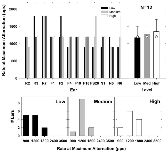
Fig. 6.
Top left: Individual data showing the rate at which the maximum alternation occurred for each subject and level. Low, medium, and high levels are indicated by black, gray, and white bars, respectively. Top right: group mean (bar height), +1 SD (lines), and median (white circles) values representing the rate at which the maximum alternation occurred for each level. Bottom row: histograms for low to high stimulus levels (left to right, respectively) indicating the number of ears that demonstrated maximum alternation at each rate.

