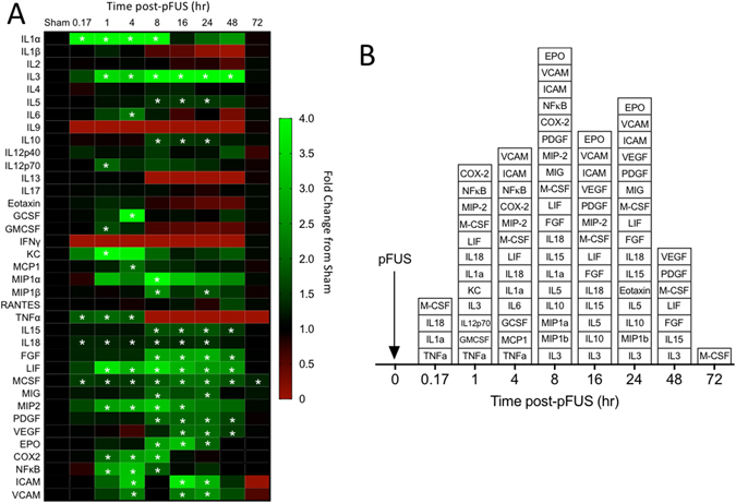
Figure 1.

Heat map and box plot of molecular response to pFUS in the kidney. (A) Heat map shows fold changes at each time point compared to sham controls (no pFUS). Increases are indicated in green while decreases are shown in red. White asterisks indicate elevations that are statistically significant compared to sham controls (p < 0.05 by ANOVA with Bonferroni post-hoc tests). (B) Box plot of significant increases at each time point.
