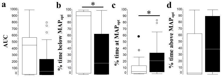
Figure 2.
Box and whisker plots of the area under the curve (AUC) below MAPOPT (a), and percent time spent below MAPOPT (b), at MAPOPT (c), and above MAPOPT (d) for girls (white boxes) and boys (black boxes) during 6 hours of normothermia (girls n=22, and boys n=38). Box and whiskers plots, boxes represent the interquartile range (IQR) limited by the 25th and 75th percentile (lower and upper limit, respectively), line inside the box indicates the median and whiskers extend up the last datapoint within 1.5 times the IQR from the median. Outliers (open circles) are those datapoints within 1.5 to 3 times the IQR from the median and extremes (closed circles) are those datapoint beyond 3 times the IQR form the median. *, p<0.05. Analysis performed by Mann Whitney U Test.

