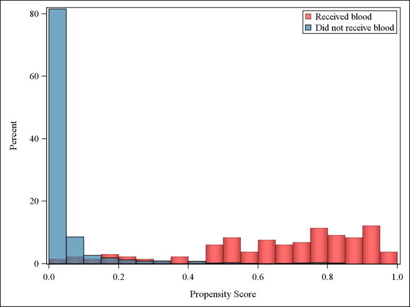
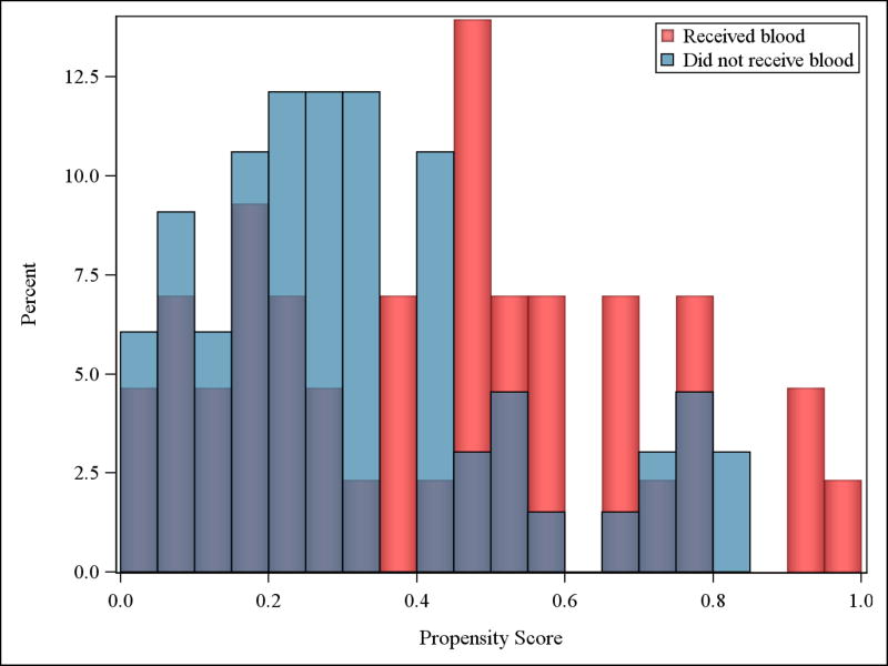
Figure 2. Distributions of propensity scores among matched and unmatched patients.
Panel A shows the distribution of propensity scores for all patients in the highest risk group who did not receive prehospital transfusion (PHT) (n=916, blue bars) relative to the distribution of propensity scores for all patients in the highest risk group who did receive PHT (n=142, red bars). Panel B shows the distribution of propensity scores in the matched patients who did not receive PHT (n=66, blue bars), relative to the distribution of propensity scores in the matched patients who received PHT (n=43, red bars). Among those patients who did not receive a PHT, very few had a high propensity score. Similarly, among those patients who did receive a PHT, very few had a low propensity score. This striking difference produces a small area of overlap between the two distributions (denoted by the purple area), representing the limited pool of similar patients across treatment groups from which to form suitable matched pairs. As expected, the distribution of the matched sample shows better overlap in purple, but still represents a small number of patients compared to the total population. Also note that the scale on the y-axis is different for panels A and B.


