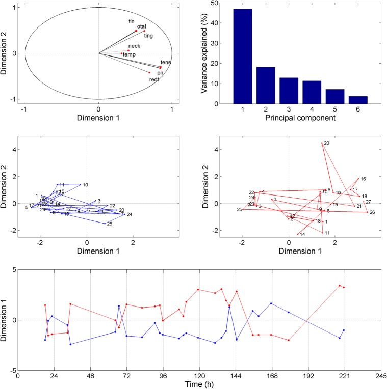
Figure 2.
Results obtained from the principal component analysis (PCA). The upper left panel represents each symptom as a function of the first two principal components derived from the PCA. The upper right panel shows the percentage of variance explained by the different principal components. The middle panels (left: left ear, right: right ear) show the symptoms plotted at each time point as a function the first two principal components. The bottom panel shows the first principal component for each ear (blue line: left ear, red line: right ear) as a function of time.

