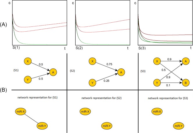
Fig 4.
The simulation of the mathematical model (panel A) and the network representation of three possible scenarios (panel B). On the upper row the dynamics of the three scenarios: (S1), (S2), (S3) are represented (panel A). Legend: red = predators, green = preys, t = time, c = concentration. The horizontal axis represents time (t) and the vertical axis the concentration (c) of the predators and preys. By simulating the model for the three scenarios, we obtained the three set of data visualized in this figure: (S1) represents a connected network, where the upper red line is the concentration of the predator Y, the lower red line represents the concentration of the second predator X and the green line is the concentration of the the prey A; (S2) and (S3) represent disconnected networks. In the second scenario (S2) the initial higher concentration of Y decreases rapidly because of the low reaction rate (0.25) and the initial lower red line (the concentration of X) increases rapidly because of the high reaction rate (0.75), the lower green line represents the prey (A). In the third scenario the initial concentrations are the same: the upper red line is the concentration of Y which decreases rapidly because of the low reaction rates (0.9 and 0.1), the lower red line is the concentration of X, which will increase, because of the high reaction rates (0.9 and 0.5), the upper green line is the prey A and a new prey appears (B)–the lower green line. The concentration of A will decrease more rapidly than that of B, because of the rising concentration of the predator X, who has a high reaction rate for A and B (0.9, respectively 0.5). On the middle and lower rows three corresponding network representations are shown (panel B). The first column of the B panel represents a scenario (S1) that could reflect the mechanisms in the control group. In this case, we have two miRNAs (X and Y) competing for one common target A. The numeric value represents the reaction rates between the miRNAs and their target. In the network representation of this scenario, the two miRNAs are connected. In the second column of panel B, the scenario S2 is depicted and its network representation. In this case, the reaction rate between X and A (0.75), is different from the reaction rate between Y and A (0.25). In the corresponding network representation, the miRNAs are no longer connected. Thus, a different reaction rate between the miRNAs and a common target could be the underling mechanism that could explain the loss of edges in sepsis. The third column of panel B represents the S3 scenario. In this scenario, a new target appears (B). The two miRNAs X and Y have the same reaction rate for the first target (A), but very different reaction rates for the new target (B), 0.1 and 0.5, respectively. In the corresponding network representation, the two miRNAs are no longer connected. The S3 scenario represents, as well, a possible underling mechanism that explains the loss of connections observed in sepsis.

