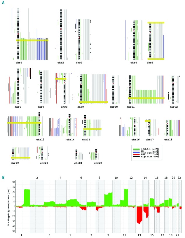
Figure 1.
Overview of results from genome-wide copy number array analysis in AL amyloidosis patients. (A) Karyogram depicting each chromosome and each patient sample as gain and loss (right and left of each chromosome, respectively). The karyogram style allows for the clear visualization of gains and losses belonging to each single patient in addition to providing an exact insight of the overall distribution of aberrations and furthermore, trisomies are easily recognizable, which is more difficult to achieve in frequency plots. Different colors indicate the following iFISH defined subgroups: all patients with a translocation t(11;14) (n=73; green) were selected into one group, of the remaining patients, those showing a hyperdiploid karyotype (HD) according to Wuilleme et al.,20 (n=18; gray) were grouped together, again of the remaining patients, those with gain of chromosome region 1q21 (gain 1q; n=14; blue) were put into the respective group. Finally, the still remaining patients were split into those with high-risk aberrations (n=5; black) and a non-hyperdiploid group (NHD; n=8; red). This categorization was chosen in order to visualize the underlying structure according to cytogenetic risk groups. Additionally, the chromosomal location of the iFISH probes is highlighted by yellow rectangles. Genomic Recurrent Event ViEwer was used to visualize aberrations.52 (B) Frequency plot providing an overview of the distributions of gains (green) and losses (red) as percentages of all 118 patients for chromosomes 1–22.

