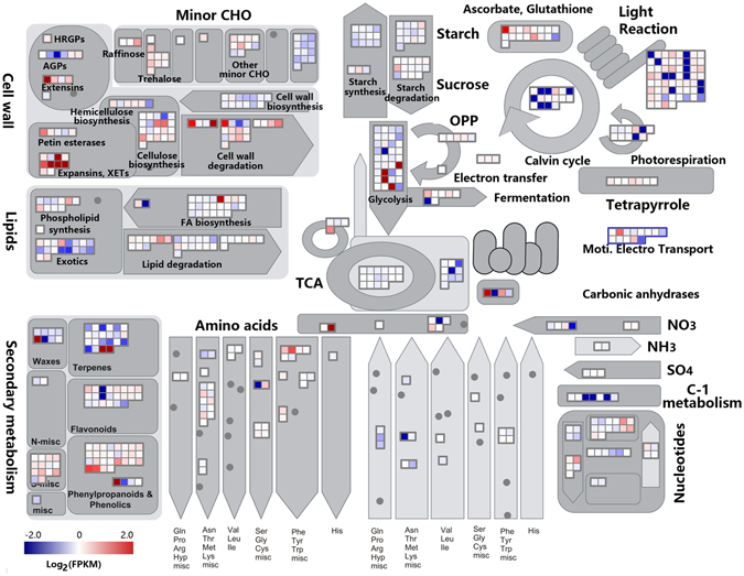
Figure 6.

A schematic overview of changes in transcript abundance in the middle internode compared to the upper internode. The log2 transformed FPKM values were imported into MapMan software to generate the overview of general metabolism in the middle internode (MI) compared to the upper internode (UI). DEGs are represented by colored squares and grouped according to functional annotation based on MapMan ontology. The fold change of DEGs is indicated by the scale bar. Red indicates up-regulation, whilst blue indicates down-regulation.
