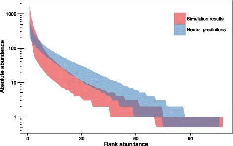
Fig. 6.

Comparison between Hypothesis 3 simulations (increasing population size) and neutral predictions. The 95% envelope for the relative abundance distributions generated by 500 simulations is shown in red, and the 95% envelope for predictions under neutral theory in blue. Log-scaled absolute abundance is shown on the y-axis and ranked abundance on the x-axis (species ranked in order of decreasing abundance)
