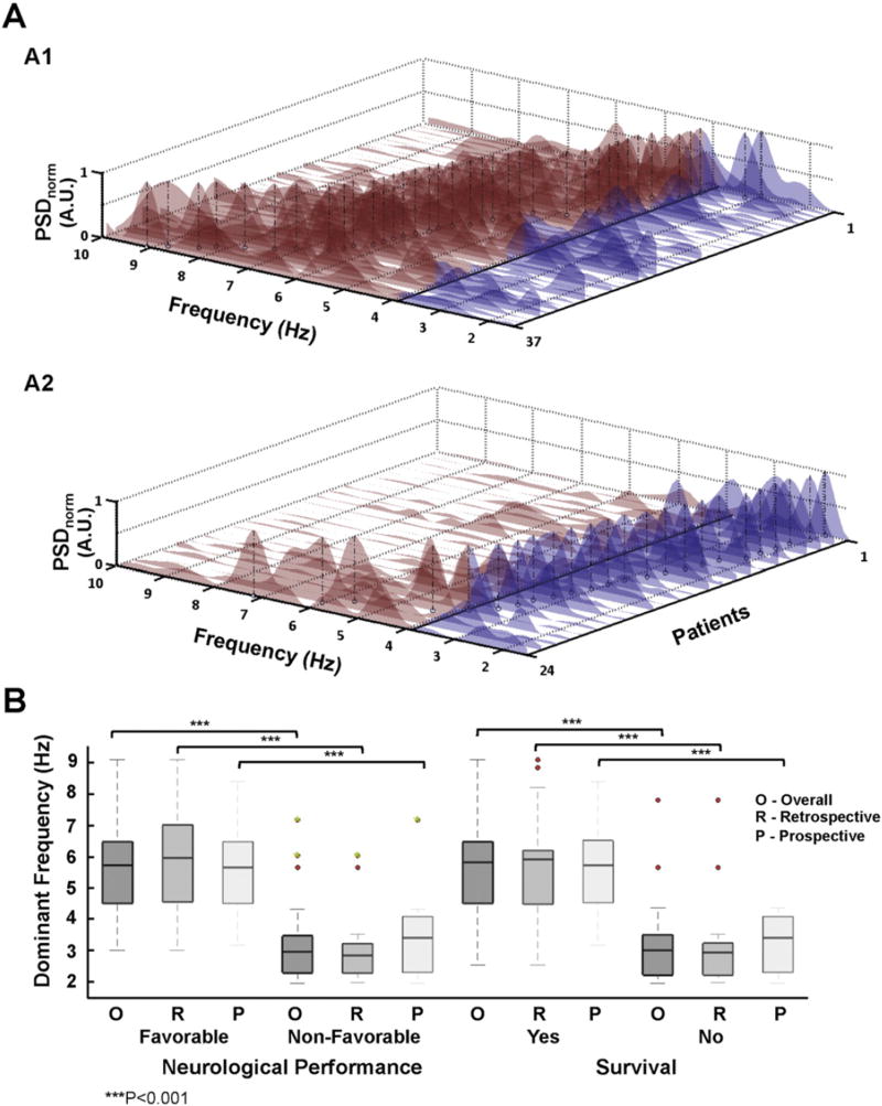
Fig. 3.
A. Power spectral density (PSD) of all patients with in-hospital favorable (A1) and non-favorable (A2) neurological performance. The patients are sorted based on their DF values. DF peaks are pointed out for each individual (black vertical dashed-line). The cut-off threshold of 3.9 Hz was chosen for color-coding above (red) and below (blue) the PSD. B. Boxplot representation of DF comparing patients from both groups for primary and secondary endpoints. Boxes depict median and interquartile range (25–75%). Red dots are outliers at least twice the interquartile range from the median. Green dots represent outliers to hospital discharge who improved neurological performance during follow-up.

