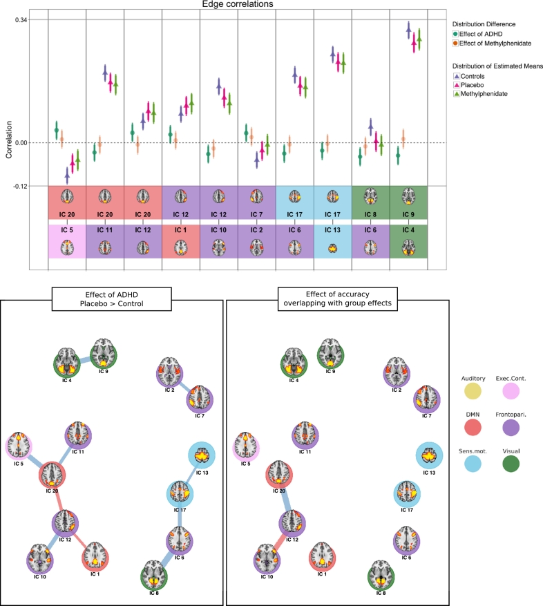
Fig. 4.
Edge correlations. Top panel: Triangles are the estimated mean distributions for the groups, circles are the calculated difference distributions between groups. Error bars denote the 95% highest density interval of the distribution. Bottom two rows depict the two nodes connected by the edge. Bottom panels: Graph representation of edges between nodes for contrasts between patients when on placebo and controls (left), and edges correlated with overall task accuracy that are also different between patients and controls (right). Blue lines indicate a negative difference; red lines indicate a positive difference. The line thickness represents the magnitude of the difference. (For interpretation of the references to color in this figure legend, the reader is referred to the online version of this chapter.)

