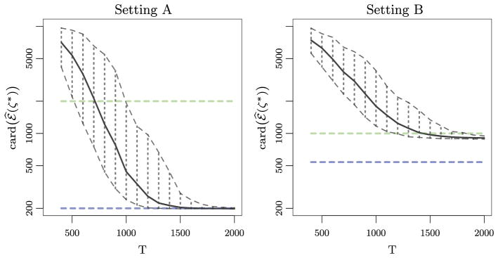
Fig. 3.
For each of 200 simulated data sets, we calculated card(ℰ̂(ζ*)), where ζ* ≡ max {ζ : ℰ ⊆ ℰ̂(ζ)}, as a function of the time period T. The curves represent the mean of card(ℰ̂(ζ*)) (
 ); the 2.5% and 97.5% quantiles of card(ℰ̂(ζ*)) (
 ); card(ℰ̃) (
 ); and card(supp(V)) (
 ). Left: Data generated under Setting A. Right: Data generated under Setting B.

