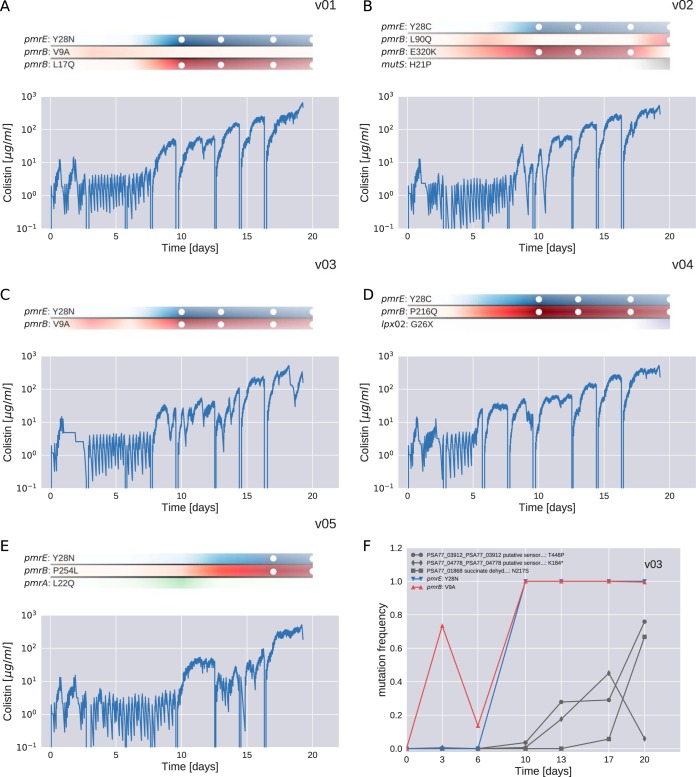
FIG 3.
Resistance evolution in PA77. Panels A to E show the dynamics of colistin concentration in liquid culture for each culture vial. This concentration is inferred from the cycles of colistin addition and waste removal in 10-min intervals. The shaded bars above the plots show the abundance of different mutations during the experiment. Time points at which a mutation reached a frequency above 95% are highlighted with white circles. The frequencies of pmrE (blue) and pmrB (red) mutations correlate well with colistin tolerance. The deep dips in colistin concentration every 2 to 3 days correspond to transfers to fresh culture vials and mark the time points at which samples were taken. Panel F shows the frequency trajectories of all mutations that reached 20% frequency in vial v03 (for analogous plots for other cultures, see Fig. S1).

