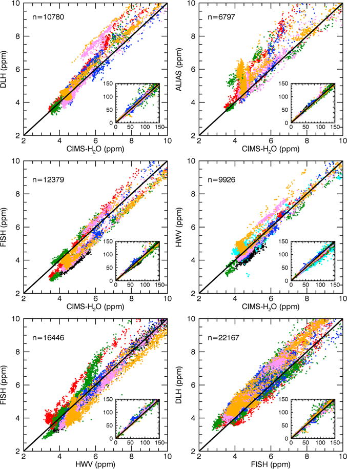
Figure 2.

Example correlation plots of DLH, ALIAS, FISH, HWV, and CIMS-H2O. Main panels show the data in the 2–10 ppm range, and insets show all data up to 150 ppm. Different flight days from 14 April to 26 April are indicated using different color markers: 14 (black squares), 18 (cyan squares), 20 (red squares), 21 (green squares), 23 (blue squares), 25 (pink squares), and 26 (orange squares) April. The solid lines are the 1-1 lines. Regression statistics are given in Tables 3 and 4. Numbers indicated in each panel (e.g., n = 10,780) indicate the number of data points shown below 10 ppm.
