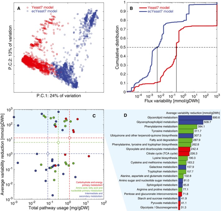
Figure 5. Integration of proteomic data into the model.

- PCA of fluxes from 10,000 random simulations of Yeast7 and 10,000 random simulations of ecYeast7.
- Flux variability for all non‐zero variable fluxes from Yeast7 (3,286 reactions, 66.1% of all reactions) and ecYeast7 (3,822 reactions, 56.7% of all reactions).
- Distribution of different pathways in metabolism based on the total usage predicted by ecYeast7 (mg gDW−1) and their average flux variability reduction (mmol gDWh−1). The discontinuous lines indicate averages of the log values for different metabolic groups. The light blue filled region highlights the pathways with the highest average flux variability reduction shown in (D).
- Breakdown of the pathways with the highest average flux variability reduction (mmol gDWh−1). Colors correspond to the metabolic groups indicated in (C).
