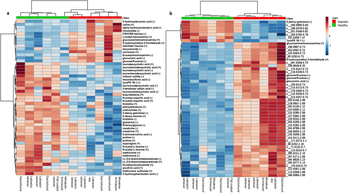
Figure 1.
Heat map representing (a) known metabolites significantly (p < 0.05) different between diabetic and healthy control dog groups and (b) top 50 known and unknown metabolites significantly (p < 0.05) different between groups. Group is indicated at the top of the figure by red (diabetic, n = 6) or green (healthy, n = 6). Individual dog breed corresponding to column is indicated at the bottom of the figure. Data was sum normalized, log transformed and autoscaled.

