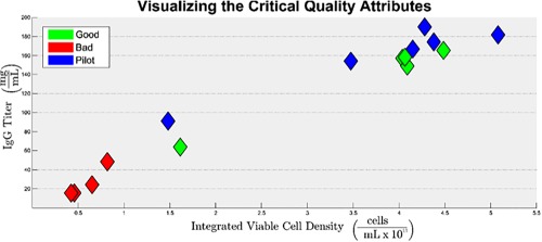
Figure 3.

Visualization of product quality; a plot of IgG Titer vs. IVCD for all 15 batches.
Batches that performed poorly, relative to one another, are clustered in the bottom left corner of the figure and batches that performed well are clustered in the upper right corner.
