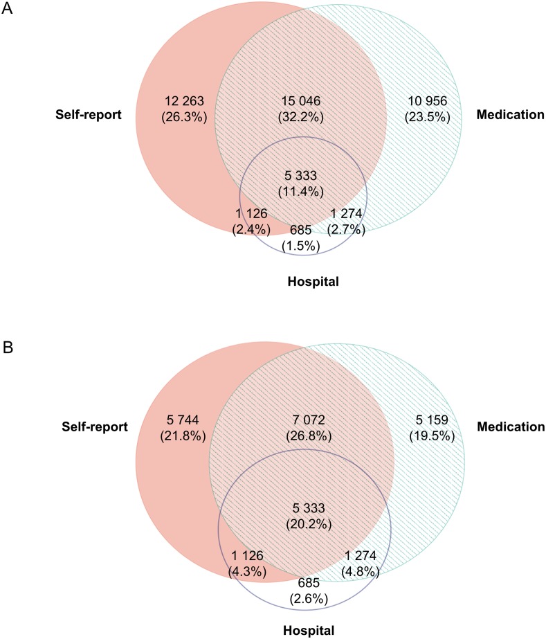
Fig 3. Venn diagram of the prevalence of multimorbidity according to data source.
(A) All data. (B) Hospitalised patients only. Percentages (%) represent the proportion of all multimorbidity cases ascertained from any of the data sources. Venn diagram constructed using EulerAPE: http://www.eulerdiagrams.org/eulerAPE/.

