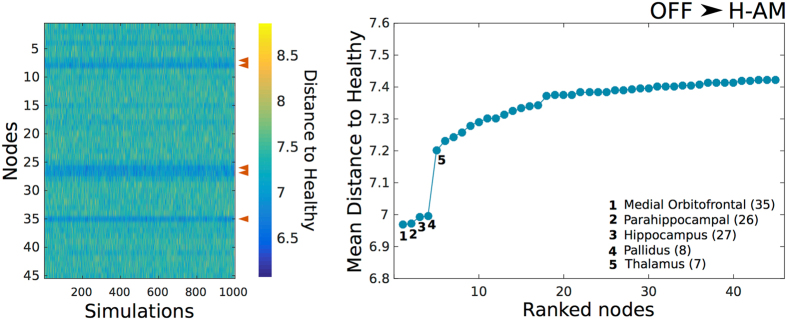
Figure 6.
Euclidean distance to Healthy from OFF after artificial DBS. Color map depicted in the left represents the distance to H-AM from OFF after artificial DBS in each of the 45 nodes across all simulations. The top 5 regions with the lowest mean distance are indicated with a red arrow. The mean Euclidean distance ranked from lowest to highest and the top 5 nodes are depicted in the right plot. Numbers in parentheses indicate the region in Table 2.

