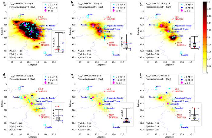
Figure 2.
Forecasted vs. observed seismicity distribution in the aftershock zone, the maps report the mean +2 standard deviation confidence interval for the number of events per [km2] (latitude/longitude cells of a 0.01° × 0.01° grid) equal to or greater than magnitude M l = 3 in the indicated 24-hour forecasting time window. In the lower left corner, the daily probabilities of having earthquakes with magnitudes 4, 5, and 6 or larger are reported. Each sub-plot also features the earthquakes (coloured dots) that occurred during the corresponding forecasting time window together with the two main events with M ≥ 5.0 (magenta stars). The sub-figures illustrate the observed (plotted in red star) vs. the error-bar for the forecasted number of events with m ≥ M l corresponding to the forecasting time interval: the median value (the 50th percentile, equivalent of the logarithmic mean in the arithmetic scale) inside a grey-filled square, the (logarithmic) mean plus/minus one (logarithmic) standard deviation indicating the interval between 16th and 84th percentiles (marked with blue horizontal lines), and the (logarithmic) mean plus/minus two (logarithmic) standard deviations indicating the interval between 2nd and 98th percentiles (marked with black horizontal lines). (MATLAB 2016b, http://softwaresso.unina.it/matlab/ is used to create this figure).

