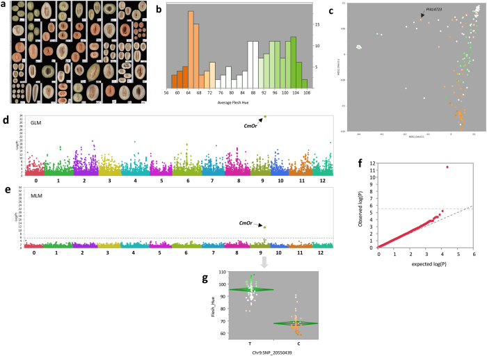
Figure 5.
Mapping of flesh color. (a) Example of scanned longitudinal sections of melons from the diversity panel. 2,650 fruits were scanned and analyzed using Tomato Analyzer software36. (b) Frequency distribution of entry mean hue index as measured from fruit scans. Bar colors reflect the visual perception. (c) Flesh hue indexes projected on genetic PCA plot. (d) Manhattan plot of GWA of flesh color. Associations were tested using naïve General-linear model (GLM) (e) Manhattan plot of GWA of flesh color. Associations were tested using mixed-linear model (MLM_Q + K) for controlling population structure and relatedness. Genome-wide significance threshold is adjusted for multiple comparisons at FDR5%. (f) Quantile-quantile (Q-Q) plot for distribution of P values at the MLM_Q + K model. The negative logarithm of the observed (y axis) and the expected (x axis) P value is plotted for each SNP (dot). The gray dashed line indicates the null hypothesis. (g) Allelic effect plot for the SNP within CmOr gene (MELO3C005449). Each point represents accession mean color (hue index) and points are color-coded based on the visual color perception.

