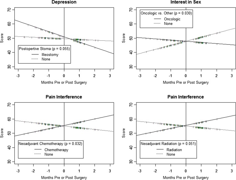
Fig. 4.
Panel plot depicting the difference in the linear change in selected patient-reported outcome measure domain scores during the perioperative period, for four example groups. In each plot, the solid and dotted lines depict the multilevel random coefficient model estimated linear functions for the monthly change in scores, for specified groups. Hatch marks plotted along the linear function identify points in time when assessments were recorded for individual patients in each compared group

