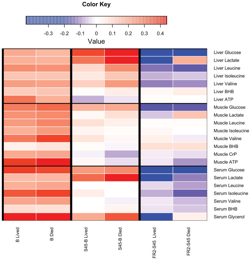
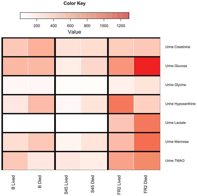
Figure 4. Heat Maps of Select Fuel Metabolites.
4A: Heat maps highlight differences in fuel metabolites (liver, muscle, serum) for each time interval discussed, according to survival. This figure is meant to be a visual guide for the reader to quickly assess differences in fuel metabolites discussed at the beginning of each compartment’s subsection in the results. Colors indicate the scaled increase or decrease in metabolite abundance. Baseline columns reflect the scaled abundance of the metabolite at baseline. Subsequent columns show the scaled increase or decrease in metabolite abundance. Red indicates an increase and blue indicates a decrease. BHB, β-hydroxybutyrate. 4B: Heatmaps highlight differences in significant urinary metabolites for each time point discussed, according to survival. Scaled metabolite abundances are shown in red, with darker shades of red indicating higher levels of the metabolite. Individual time points are shown instead of time intervals as in Figure 3A because urine metabolite levels are expressed in terms of hourly urine output (nanomoles of metabolite per hour per kg). TMAO, trimethylamine N-oxide.


