
Figure 7. Dynamics of Dendritic De Novo Arc-Gluc Translation Events.
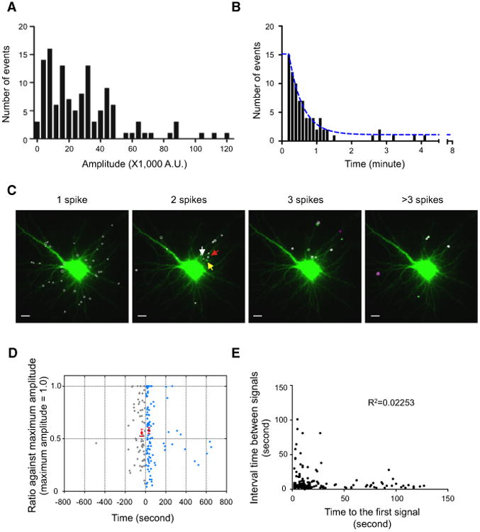
(A) The distribution of peak amplitude of spikes fromone example cell.
(B) Histogram of time interval between the spikesat hotspots. Blue line, nonlinear fit (K = 0.043, t½ =16.29 s, n = 82, N = 10 cells).
(C) An example showing the distribution of puncta with a single flash (one spike) and repeated flashes (translation hotspots; more than two spikes). Different colored circles represent the number of flashes at the same center of the signal (white, single; green, two; magenta, three flashes). Three arrows are marked for Movie S6. Scale bar, 10 μm.
(D) Relationship between consecutive peaks to that of maximum peak. Normalized intensity of consecutive peaks at translation hotspots with two flashes is plotted as a function of the time interval from maximum peak. The time frame is aligned such that the maximal peak time is set to zero. In 60% of cases, first peak is the maximal peak and the following peak is color coded in blue. When the first peak is followed by the maximum peak, it is plotted in gray on the left of the y axis. The two red circles represent the average of the smaller peak that occurred within 100 s of maximal peak (time interval after maximum peak = 33.2 ± 1.9 s, normalized amplitude = 0.58 ± 0.03, mean ± SEM, n=99, N= 12 cells; time interval before maximum peak = 36.8 ±3.4 s, normalized amplitude = 0.56 ± 0.04, mean ± SEM, n = 53, N = 12 cells). See also Figures S5F and S5G.
(E) Inter-flash interval relative to the time of the first flash after addition of glutamate (R2 = 0.2253, n = 158, N = 17 cells).