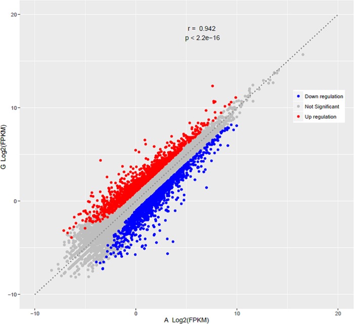
Fig 4. Comparison of differentially expressed genes between the two breeds.
Scatter plot showing the correlation of gene abundance. Red points represent genes upregulated by at least two fold at FDR ≤ 0.05, blue points represent genes downregulated at the same thresholds, and grey dots indicate transcripts that did not change significantly.

