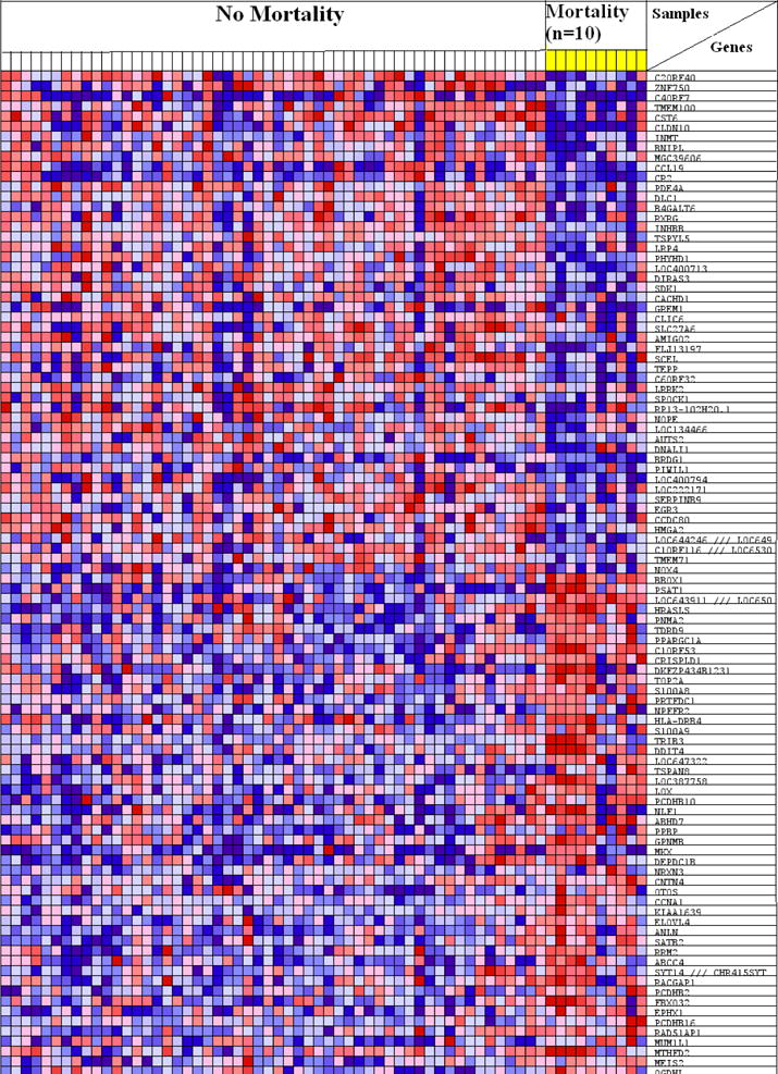
Figure 1.

Heat map of top 100 ranked genes separates patients with and without mortality. Yellow columns represent samples from patients with mortality. In the heat map, relative gene expression levels are represented as colors (range: high (in red) to low (blue).
