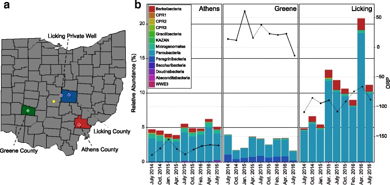
Fig. 1.

Map of Ohio and CPR relative abundance through time. a A map of Ohio with studied colors indicated by various colors; colored circles represent the approximate location of the Ohio Department of Natural Resources (ODNR) sampling wells and one private well. Columbus, OH, is indicated as the yellow dot for reference. b Stacked bar chart of CPR phyla relative abundances from the three ODNR sampling locations (Athens, Greene, and Licking). Oxidation-reduction potential (ORP) is plotted atop the abundance graphs as line graphs
