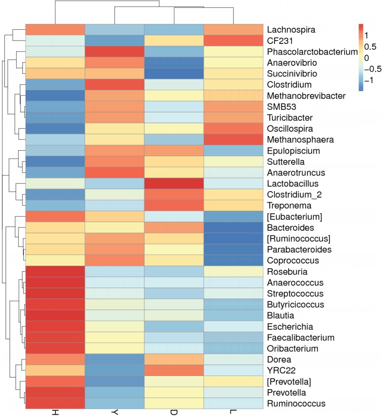
Figure 6.

Species abundance heatmap showing normalized values of 35 differentially abundant genera of four boar pig breeds. Breed name is plotted on the X-axis, and the Y-axis represents the genus. The different colors represent the distance between the raw score and the mean population of the standard deviation. Red indicates that the z-value of a specific genus is larger than the mean, whereas blue indicates the opposite. D, Duroc; H, Hampshire; L, Landrace; Y, Yorkshire.
