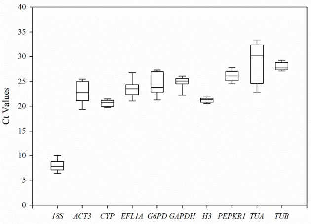
Figure 3.

The threshold cycle (Ct) distribution of each candidate reference genes in all experimental samples. A lines across the box of Ct value represent the median values. Lower and upper boxes show the 25 and 75% percentiles. Whiskers represent the maximum and minimum Ct values. The y-axis represents the Ct values of three biotechnology replicates of all experimental samples, while the x-axis represents the 10 candidate reference genes.
