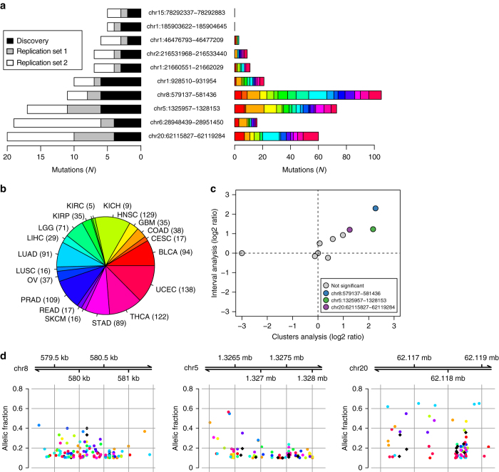
Fig. 3.
Analysis of breast cancer putative driver DHSs in other cancer types. For each of the ten putative driver DHSs, the barplots show the number of mutations detected in a discovery and the two replication sets and b all 19 cancer types. The pie chart represents the distribution of the 1,097 samples in TCGA across the cancer types (definitions shown in Supplementary Fig. 5). c Pan-cancer mutation analysis of the ten putative driver DHSs. The X-axis represents the log2 ratio of the cluster analysis (mutation density of each putative driver DHS compared to 20 random DHSs with similar sequence characteristics). The Y-axis represents the log2 ratio of the interval analysis (each putative driver DHS compared to the surrounding 100 kb). DHSs that are not significant (gray) and significant in both tests (color-coded) are shown. d Spatial distribution of the mutations within the three putative driver DHSs across tumor types (colored as in b; breast cancer is represented by black diamonds). The Y-axis represents the allelic frequency of each mutation

