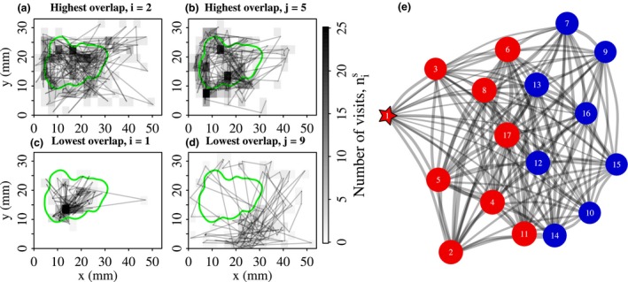
Figure 3.

Classifying ants into groups with distinctive space use patterns. This figure illustrates the procedure for colony 1. (a, b) Trajectories of the two ants with the most similar space use patterns. Site greyscale indicates the number of times the ant visited each site, . The spatial overlap between , and , is VI. The green line indicates the edge of the brood pile. (c, d) Trajectories of the two ants with the most dissimilar space use patterns, which have VI. Note, ant i = 1 is the queen. (e) Network representation of the spatial relationships between ants. Edge widths are proportional to the magnitude of the pairwise spatial overlap, VI. Vertex size is proportional to the weighted degree centrality. The queen is indicated by the star. Vertices are coloured according to their community membership. For this colony, two communities were detected. Red nodes – ants in the queen community, labelled ‘nurses’. Blue nodes – ants in the second community, labelled ‘other’.
