
Fig. 6.
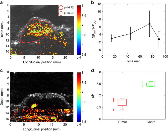
Statistical analyses of the PAI results from the in vivo mouse model. a A close-up view of the PA pH image of a tumor shown in Fig. 5 (75 min). The pH in the center area (i.e., the area in the solid line) and the peripheral areas (i.e., the area between the solid line and the dash line) are averaged respectively. b Analysis of the SNARF-PAA NP accumulation in the tumors at different time points after systemic injection represented by the ratio between the NP concentrations inside and outside the tumor (NPIN/NPOUT). With the measurements from four animals (n = 4), the average and the standard error for each time point are presented. c Example PA pH image of a normal tissue (i.e., thigh), showing relatively higher pH. d The boxplot showing the pH levels in tumors (n = 4) vs. the pH levels in normal tissues (i.e., thigh) (n = 4), as quantified from PA pH images. The measurements from individual sample (tumors and thighs) are also presented by scattered points