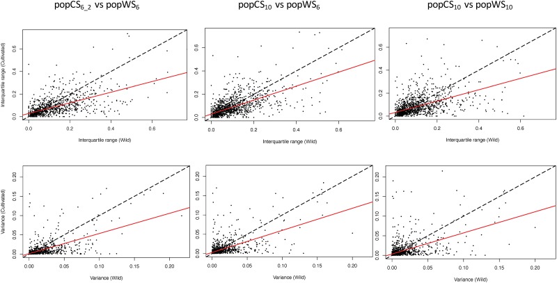
Fig 2. Dot plot comparison of the eT-ratio spread among cultivated and wild type populations.
In each plot a dot represents a gene whose position corresponds to its eT-ratio spread measure by interquartile range (resp. variance) in the three top (resp. bottom) plots, observed in a sample of cultivated sorghum (abscise) and in a sample of wild sorghum accessions (ordinate). The red lines represent the linear interpolation of those points (the line slopes are provided in Tables 3 and 4) and the dashed lines depict the y = x line to ease picture interpretation.

